One-Year Evolution of Embeddable UI
We look back at the evolution of the Embeddable UI over the last year, since it's early inception to the clean, functional and elegant UI we have today.
.jpg&w=64&q=75&dpl=dpl_HneCcwkFY4JTKQqk1LmLNP9h9nPY)
Summarize with:
 ChatGPT
 Perplexity
Into the unknown
A year ago, driven by the vision to bring Embeddable to market, we set out to build a no-code app that fused the capabilities of BI tools with the flexibility to create and publish custom, interactive dashboards. Our objective was to rapidly launch a functional prototype, venture into the unknown, and gather insights from early adopters.
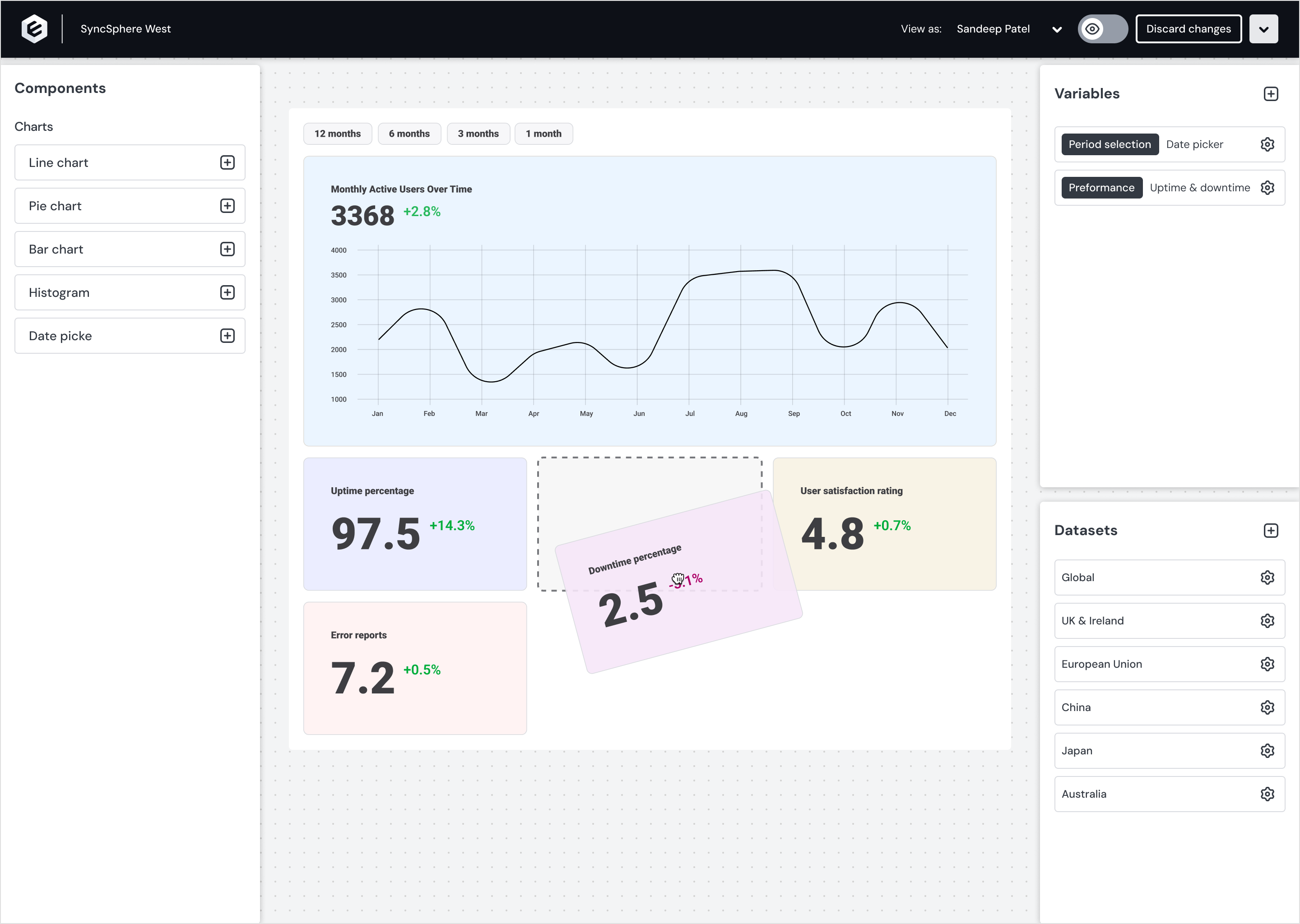
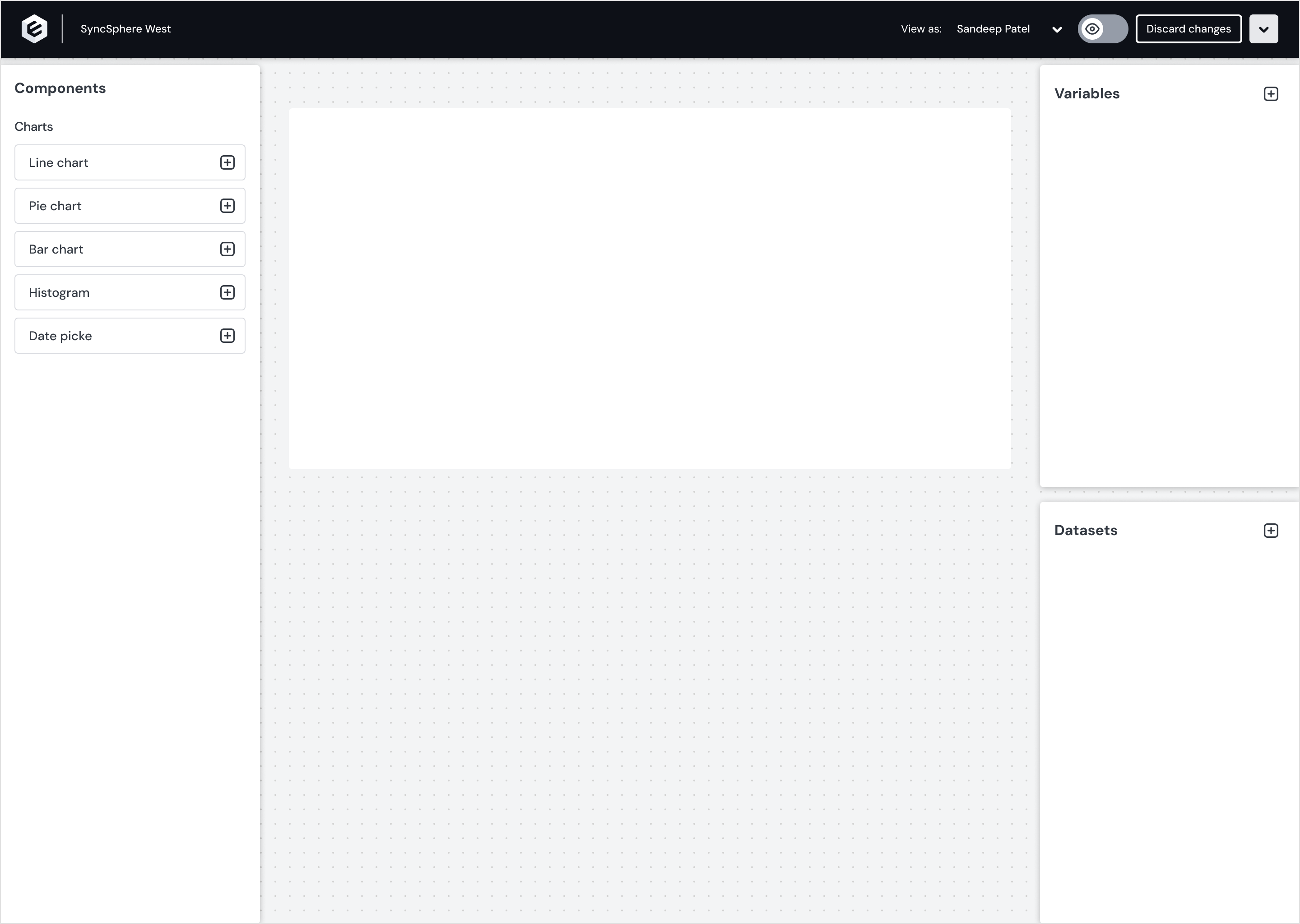
Within two weeks, after many workshops with stakeholders, the design team laid the foundation of what now is known as Embeddable. Our efforts were focused on developing the simplest interface consisting of interactions for variables, databases, and chart configurations.
We intentionally kept the design neutral, allowing users to concentrate on their charts and dashboards and for us to concentrate on getting our UX right.
While the final product offered a usable experience to early adopters, it felt overly sterile and utilitarian. We knew it lacked a cohesive design framework and a well-organized Figma structure to support future product evolution.
Becoming Human-Friendly
Before launching our new brand, we took time to reflect, understand the product better, define our direction, and lay the groundwork for future development.
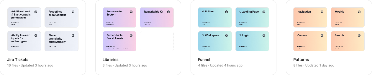
We reorganized Figma by separating projects into Libraries, Patterns, Funnel, and Jira tickets. This helped us manage the big picture and stay focused, avoiding getting lost in the large number of Jira tickets feeding into Patterns, the Design System, and the Funnel.
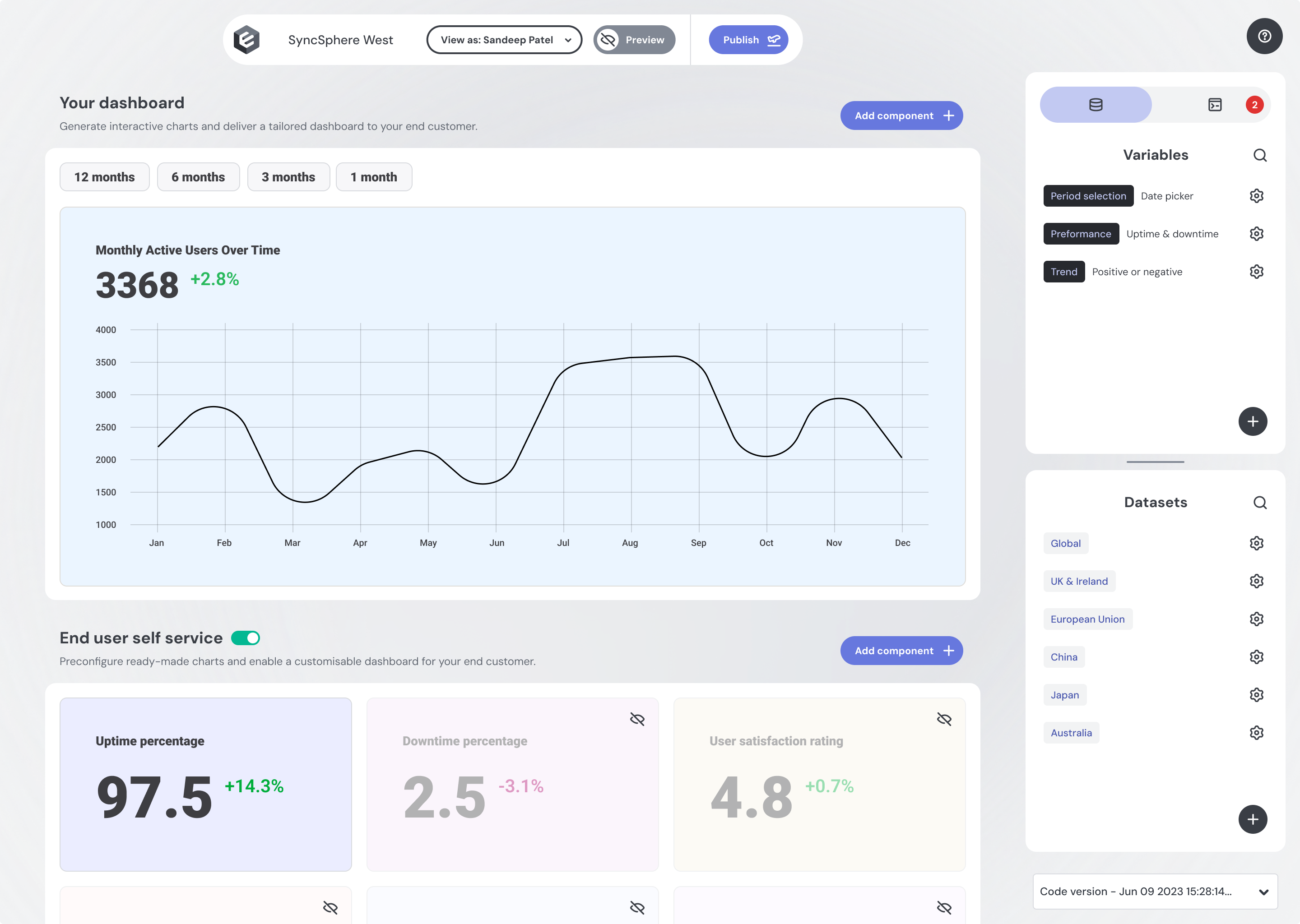
The journey to become more human-friendly began with a simple step - we introduced rounded corners, replaced the heavy black header with an island design, and swapped the background pattern for an uneven, organic blur that creates a calming sense of depth.
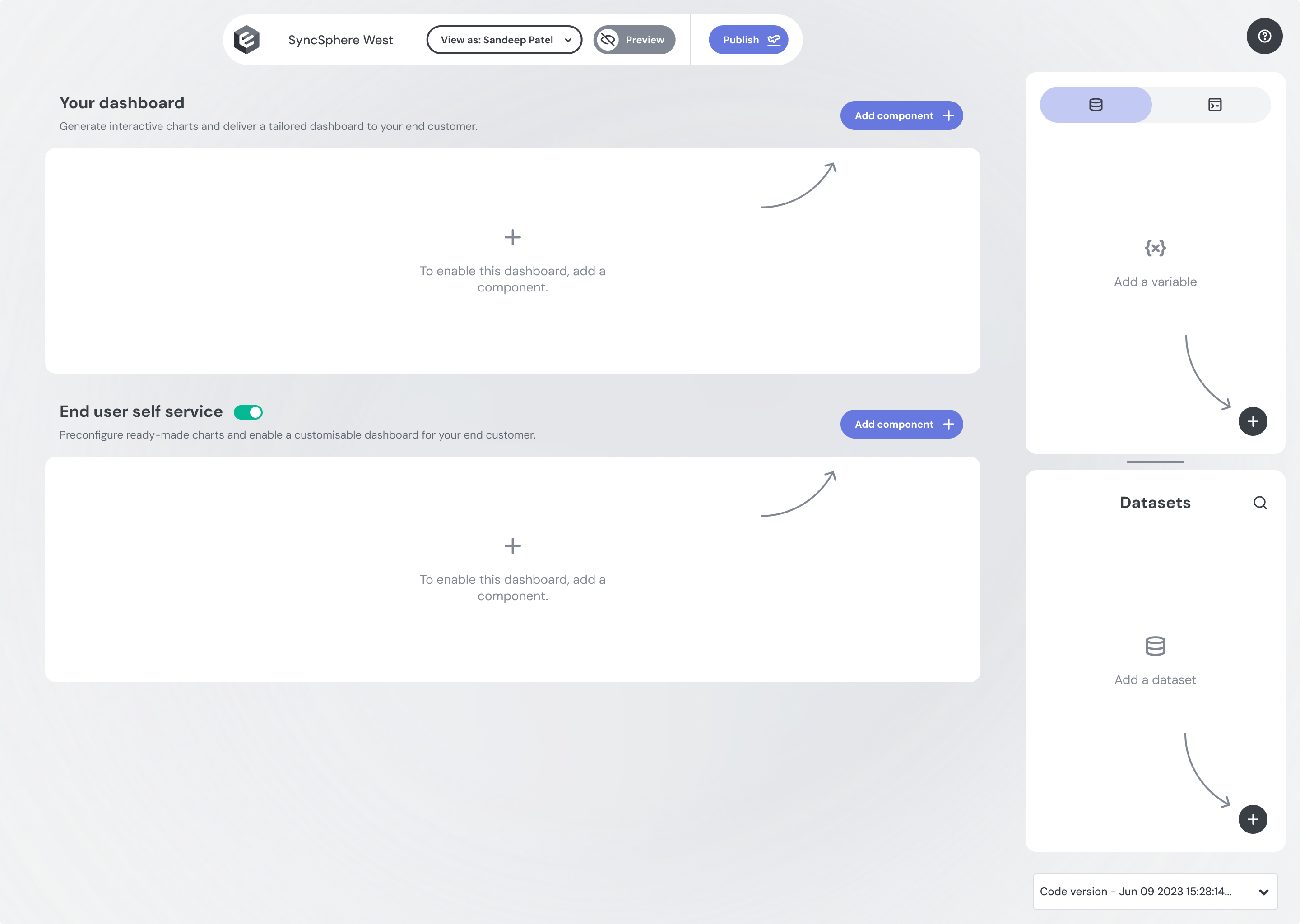
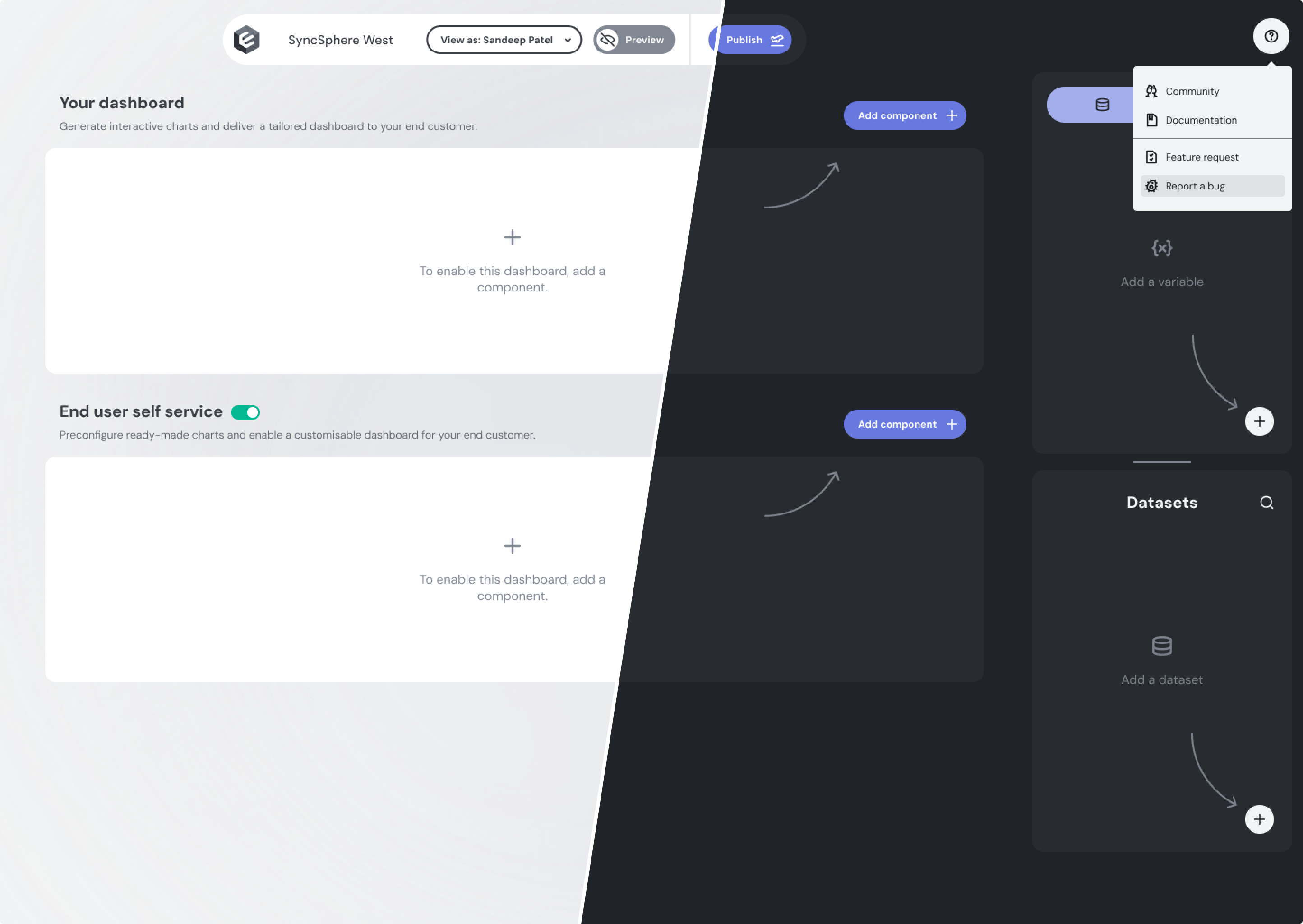
We established a Design System we now refer to as the Remarkable System, featuring in-depth documentation, dark and light modes, and structured variables. The project that marked the transition to our new look had a code-name “Lipstick Pig”. We called it this to describe the action of applying lipstick on top of our little pet Embeddable. It was a big makeover for the product. Our customers responded positively to this change and we continue to receive positive feedback about our chosen aesthetic.
We introduced motion where it makes the most sense, such as animated buttons that expand when approached by the cursor, giving the impression that the interface responds to your intentions.
As we grow, we'll add more motion, and we look forward to the app evolving with smoother user interactions.

The final result is an interface that is neutral in appearance—yet fresh and modern—combining the power of BI tools without being sterile or overly utilitarian. Most importantly, it enables us to evolve rapidly, making Embeddable the best toolkit for building fast, interactive customer-facing analytics directly into your product.