.jpg)


If you’re building charts and dashboards into a React application, you’ll either be embedding them via a third-party embedded analytics tool or you’ll be coding the charts yourself. If you choose to build in-house using your developers, then using charting libraries is a no-brainer.
Today, we'll give you an overview of the top React chart libraries, the available chart types in each, and what each charting library is best for.
We’ll also explain how to use React charting libraries in Embeddable, the embedded analytics tool that allows developers to import their own charts, or modify and extend the charts provided in React code.
What is a React charting library?
A React charting library is a collection of pre-built React chart components that enable you to present structured data int visual charts such as line, bar, pie, heatmap, or network graphs.
Instead of writing low-level SVG or Canvas code, you describe the chart in JSX, pass the data as props, and let the library handle scales, axes, colors, animation, and updates whenever your application state changes.
Because these libraries rely on React’s rendering cycle, charts stay in sync with the rest of your interface, respond to user input through familiar event handlers, and can be composed or styled just like any other component.
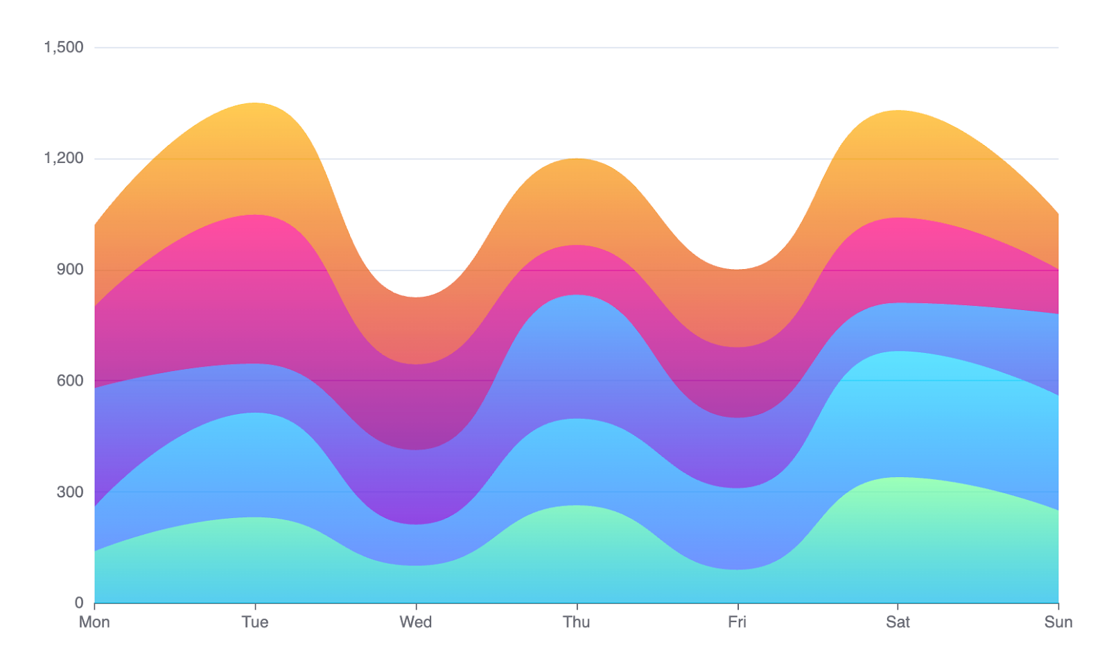
For customer-facing analytics, it's crucial to have a wide range of chart types to illustrate different data points.
The best React chart libraries for your data visualization needs in 2025
The right charting library can help you create charts for your own unique needs and help your end-users understand chart data more easily. These are some of the best charting library choices in 2025.
Recharts
Recharts wraps the most useful pieces of D3 in idiomatic React components, so you can add charts with a JSX‑style API and familiar props. It relies on SVG, which keeps markup readable and lets you style charts with plain CSS. Animation and responsive sizing come baked in, yet the package stays light enough for production dashboards.

Available visualizations:
- Line, area, and bar (standard and stacked)
- Pie and donut
- Scatter and bubble
- Radar and radial bar
- Treemap and composed chart (mix several series in one canvas)
Recharts is best for: teams needing to deliver robust, simple charts fast. Recharts is a ‘drop-in, batteries included’ library, meaning it’s really simple to use, but it makes a lot of decisions for you, meaning you’ll get a bit less flexibility than with other tools.
Think of Recharts when you are building a SaaS or marketing dashboard and you just want the numbers to show up without a fuss. It also feels right at home in an admin panel or any internal tool where quick theming matters more than fancy gimmicks.
Learn how to use Recharts in Embeddable
Nivo
Nivo offers one of the widest selections of chart components for React, all driven by D3.js under the hood. Each component supports motion, theming, and server‑side rendering, so you can export static images or run full‑blown interactive charts in the browser.
Available visualizations:
- Line, area, bar, stream, and bump
- Pie, donut, radar, and radial bar
- Heatmap, calendar, waffle, and bullet
- Chord, sankey, network, and sunburst
- Treemap, swarm plot, and choropleth
Nivo charts are best for: when you need lots of different chart types on the same site, for example, a news outlet that tells stories with data or a marketing page that loves eye‑catching graphics. Many SaaS teams pick it too because one library covers nearly every visual they will ever need.
Victory
Victory, maintained by Formidable, focuses on modular building blocks that share a consistent API. Accessibility helpers and ARIA labels come standard, making charts friendlier to screen readers. Its CSS‑in‑JS approach lets you swap themes quickly while keeping bundle size predictable.
Available visualizations:
- Line, area, bar, and stacked counterparts
- Pie and funnel
- Scatter, bubble, and histogram
- Candlestick and error bars
- Voronoi overlays for tooltip regions
Victory charts is best for: teams that care about accessibility, and for product teams that already run a shared design system and want every chart to follow the same rules. It is also friendly for side projects that start simple but might grow later.
Visx
Visx from Airbnb gives you low‑level D3 primitives wrapped in React, leaving styling and layout entirely in your hands, i.e., it’s not a drop-in component library. Because components are small and tree‑shakable, you only ship what you use, which keeps performance high even with many graphs on screen.
Available visualizations:
- Bar, line, area, and brushable combinations
- Pie and donut
- Heatmap and density plots
- Radial charts and networks
- Custom shapes built from geometric primitives
Visx is best for: engineers who enjoy full control and custom layouts. It works well in consumer apps where smooth interaction is key and in busy dashboards that must load fast even with many charts on screen.
TanStack Charts
TanStack Charts ships a headless core that manages scales, axes, and interactions, leaving rendering to your preferred SVG or Canvas elements. It integrates neatly with TanStack Table and Query, which simplifies data flow in React apps that already lean on those libraries.
Available visualizations:
- Line, area, bar charts, and stacked versions
- Scatter and bubble
- Candlestick and financial time series
- Mixed series in a shared axis layout
TanStack charts is best for: financial data visualization or trading dashboards that plot dense time series. It pairs nicely with other TanStack tools in internal business intelligence apps, and it suits any project that wants a headless core and is happy to handle its own rendering.
ECharts for React
This React wrapper exposes the full power of Apache ECharts in React, including GPU‑accelerated Canvas and WebGL modes. It handles millions of points, dynamic data loading, and advanced interactions like brushing and drill‑down out of the box.
Available visualizations:
- Line, bar, area, and parallel coordinates
- Scatter, heatmap, and 3D scatter or bar
- Radar, gauge, funnel, and sankey
- Candlestick, box plot, and calendar
- Geo maps, choropleth, and globe views
Echarts is best for when you deal with huge or streaming data sets like telecom or IoT metrics. It is also handy for geospatial work with maps and for large enterprise dashboards that need uncommon chart types without writing custom code.
Learn how to use Echarts in Embeddable
Chart.js (with React Chart.js 2 ( wrapper)
Chart.js is Canvas‑based, so it performs well on mobile and handles animations smoothly. Its plugin ecosystem covers tooltips, annotations, and export helpers. React Chart.js 2 is a thin wrapper lets you use Chart.js in React without extra glue code.
Available visualizations:
- Line, area, and bar
- Radar and polar area
- Pie charts, donut charts
- Bubble and scatter
- Mixed series in one canvas
Chart.js is best for: lightweight tasks where specialty charts are not required and speed to market is important. This might be projects like marketing pages, slide decks, or quick university projects where familiarity speeds you up. Because it relies on Canvas it feels smooth on mobile too.
ApexCharts
ApexCharts offers a React wrapper which focuses on modern interactions, smart annotations, and responsive design. Built‑in support for mixed series means you can combine bars and lines in one view without extra configuration.
Available visualizations:
- Line, area, and mixed bar‑line
- Candlestick, box plot, and range bar
- Pie, donut, radial bar, and polar area
- Heatmap, treemap, and timeline
- Scatter, bubble, and radar
Apex charts is best for visualising financial data give its range of interactive candlestick and range charts, but can also be a great fit in operational dashboards that benefit from live updates and annotations. Many SaaS products choose it when they want mixed bar and line charts without digging into low-level code.
Find out how to use Apexcharts in Embeddable
Which React charting library should I use?
Choosing the right library will depend on how much effort you want to put in, and how much flexibility you need. These libraries range from ‘ready-to-go’ charts, to more flexible low-level libraries that give you extra power (at the cost of more dev work, naturally).
They also vary in the types of charts they specialise in, so if you need something specific, keep in mind what’s achievable in each library.
If you need…
• Low-effort standardised charts, choose Recharts or Chart.js.
• Flexible, Low-Level components to build on, choose Visx or TanStack.
• Enterprise-Grade & Geospatial charts, choose ECharts or Nivo.
• Specialty charts & Annotations, choose Victory, ApexCharts.
Build faster with Embeddable + your favorite charting library
You’re probably thinking ‘Embedded analytics tools are slow, clunky and don’t look like my app’. You’d be right, most tools are general-purpose BI tools with embedding functionality as an afterthought. But not with Embeddable.
Embeddable was built from the ground up for developers to create customer-facing dashboards in SaaS applications, so it’s designed to give you full control over the UX and UI, load fast, and be a dream for developers to build with.
Embeddable can be paired with any React charting library to give you the speed-to-market of an off-the-shelf embedded BI tool, but with the full control of a custom-built dashboard with your chosen charting library.
Find out how to get started in our docs.