.jpg)


Your customers need data to make smarter, more data-driven decisions. But how you present that data makes all the difference. Is it going to be a poorly formatted bunch of charts cobbled together in your app or a fully custom experience with smooth UI and UX?
For developers, product managers, CTOs, and anyone else who wants to give their end-users a spotless embedded analytics experience, there is only one option: white-labeling. But if the goal is to make the user experience feel like it’s truly part of your application, then it’s worth making sure that the tool you choose will truly help you achieve that.
In other words, you need to find out what white-labeling is and to what extent you can white label your dashboards. Then comes the more exhausting part: figuring out which embedded analytics tools offer white-labeling and to which degree.
We’ve done the hard work for you and rounded up the best embedded analytics tools and the exact ways you can use them for white-labeling.
Get access to Embeddable for fully white label embedded analytics.
TL;DR
- White-label embedded analytics lets you integrate third-party analytics into your app while making it look and feel like a native feature.
- There are three main levels of white-labeling: basic (logo removal and simple theming), standard (deep branding control within vendor UI), and advanced (full UI control with headless, code-based integration).
- Key factors to evaluate include custom domains, theming depth, UI element control, embedding method, authentication options, and the customization-to-effort ratio.
- Basic tools like Metabase Pro, Power BI Embedded, and Tableau Embedded are quick to set up but have limited customization and often use iframes.
- Standard tools like GoodData, Luzmo, Qrvey, and Yellowfin allow stronger branding, CSS overrides, and domain mapping but still keep the vendor’s UI framework.
- Advanced tools like Embeddable and Sisense Compose SDK are iframe-free, fully code-driven, and give you complete control over the look and feel.
- Iframe-free embedding offers better styling flexibility, performance, and seamless interaction with your app’s design system.
- Choose basic white-labeling for speed, standard for deeper branding without full coding, and advanced for pixel-perfect integration when analytics is central to your product.
What is white-labeling, and why does it matter?
White-labeling in embedded analytics means using a third-party analytics platform inside your application, but rebranding and customizing it to appear as if you built it in-house.
In practice, this lets you deliver features like interactive dashboards or reports to your customers without developing an analytics module from scratch, all while maintaining your product’s look and feel.
Your users get seamless data insights within your software, and they often won’t realize an external tool is powering those charts, which is exactly the goal.
Key reasons white-labeling matters for customer-facing analytics include:
- Brand consistency: Your analytics should match your application’s branding (colors, logos, typography, padding, spacing, etc.) so it feels like a native part of the UI. A fully white-labeled dashboard carries your product’s name and design system, not the vendor’s, reinforcing your brand’s credibility and polish.
- Unified user experience: Customers expect a smooth, integrated experience. White-labeling ensures users aren’t jarred by off-brand screens or watermarks, and the analytics interface blends into your app’s workflow. This consistency builds trust and avoids confusion, since users won’t feel like they’ve been bounced to a different platform just to view their data.
- Security & trust (domain masking): Many white-label programs support custom domains or CNAMEs, meaning you can host analytics on a subdomain of your product (e.g., analytics.yourcompany.com). This gives users confidence they’re still on your site. For example, some tools let you use white-labeled URLs and custom domains for embeds. Domain masking not only looks professional but also avoids issues with strict IT firewalls or cookie settings that can arise with third-party iframes.
Example: A white-labeled embedded dashboard has your company’s logo, brand colors, and fonts. The analytic panels and charts are styled to match the rest of the application’s user interface, which makes the third-party tool essentially invisible to the end user.
Above all, the goal of white-label embedded analytics is to make the analytics feature feel completely proprietary (as if your team built it) while saving development time by leveraging a third-party platform.
Different vendors achieve this to varying degrees and with different techniques, as we’ll explore in a moment. Some basic solutions only hide their logo, while advanced ones allow you extensive rebranding and even embedding analytics directly in your front-end code.
Levels of white-labeling in analytics tools
Not all “white label” analytics offerings are equal. Based on your needs, customer expectations and the amount of time and money you can invest, you can choose from several different types of white labeling.
Basic white-labeling
At minimum, the tool lets you remove or replace the vendor’s logo and perhaps apply a couple of simple branding changes. This prevents obvious third-party branding but often goes no further.
The analytics content is typically embedded via an iframe or hosted on a different URL, with very limited customization beyond maybe color themes or a logo swap.
This level achieves a bare-bones white label: your logo is present, but the charts and dashboards may still look somewhat out of place. (Example: the free version of Metabase always shows a “Powered by Metabase” watermark; paying for the Pro version allows that badge to be removed and a simple color/logo update.)
Standard white-labeling
Here the tool provides more robust branding and styling options. You can usually match the colors, fonts, and visual style of your app’s design system so the embedded analytics theme aligns more closely with your UI.
These platforms often allow custom CSS styles or preset themes, maybe even custom domain mapping for the analytics portal. However, the layout and components are still largely provided by the vendor’s UI.
In many cases, content is still embedded via an iframe or a fixed container, but you get to skin it more extensively than with basic white-labeling.
This level covers most “embedded BI” offerings, where you can achieve a seamless look through configuration (e.g., changing toolbar colors, hiding navigation elements, adding your logo, etc.), but you cannot fundamentally change how the charts or menus behave outside of the vendor’s limits.
Advanced (full) white-labeling:
The most flexible solutions allow deep customization and even programmatic control over the analytics components. Rather than a locked-down iframe with a menu of canned charts, these tools might embed via a Web Component or a JavaScript/React SDK that renders customised charts natively in your application’s DOM.
This means you can style everything with your own CSS, import your UI elements, or even extend/modify the provided chart components in code.
Advanced white-label analytics are often described as “headless” or “developer-first” – they give you building blocks (data queries, visualization libraries, interactive components). Still, you assemble and style the UI, achieving a completely bespoke look.
The upside: users absolutely cannot tell a third-party tool is in use, because every pixel can be made consistent with your app. The trade-off: it requires more development effort, and the tool must support this level of openness via APIs or SDKs.
In summary, basic white-labeling hides the vendor’s identity, standard white-labeling lets you reskin the UI to your brand, and advanced white-labeling lets you essentially build your own analytics UI on top of the vendor’s engine.
Next, we’ll discuss what to look for when evaluating these capabilities.
How to evaluate white label embedded analytics tools
When comparing embedded analytics platforms for white-label use, pay attention to a few critical features:
Domain white labeling (custom hostnames)
Can the analytics be served under your application’s domain? Fully white-labeled solutions allow CNAME mapping or custom domains for any embedded content or analytics portals.
This way, users see URLs on your domain (e.g., analytics.yourapp.com/dashboard/123 instead of a vendor URL) and cookies/security remain aligned with your site. Domain white-labeling also often implies the tool supports configuring email senders, favicon, and other web-hosted assets to use your branding.
Theming and styling options
Evaluate how deeply you can customize the appearance. All tools will let you set a primary color and upload a logo; the better ones let you adjust fonts, chart color palettes, backgrounds, spacing/padding, and even CSS classes for fine-grained control.
Ideally, the tool supports global theming (to apply your design system) and perhaps component-level styling (e.g., style individual widget chrome, button shapes, iconography to match your app). Some platforms explicitly let you inject custom CSS or override style variables, which can be very useful for a close match.
Use of your design elements
Beyond basic theming, consider if you can introduce parts of your own design system into the analytics UI. For example, can you replace or augment UI components such as filters, buttons, or icons with ones from your app?
Advanced tools may let you do things like embed your own navigation controls, custom action buttons on charts, or entirely custom chart types. The more you can insert your own UI elements or remove vendor-specific ones, the more seamless the integration will feel.
Embedding method & native integration
Check whether the tool embeds via iframes or directly into the DOM via a JavaScript SDK/web component. iframes are simple to use but come with drawbacks: they act like a “black box” – you can’t easily pass interactive data or events in and out, and the content might feel slightly segregated from the rest of your app.
Modern embedding methods (like using a web component or framework SDK) allow two-way communication and dynamic control (for example, programmatically applying filters or responding to user clicks). If achieving a truly native feel is a priority, favor solutions that avoid iframes and support richer integration techniques.
Many legacy BI tools only offer iframed embeds, whereas newer embedded analytics-specific tools often provide a DOM-based embed option.
Authentication and user experience control
In customer-facing analytics, you’ll need to manage user authorization and possibly multi-tenant data segregation. A good white-label analytics tool will integrate with your auth system (support Single Sign-On, JWT or SAML authentication, etc.) so that users don’t have to log in separately.
Also consider if you can control the user’s journey: Can you hide or customize loading screens (e.g., use your own loader animation instead of the vendor’s)?
Can you control navigation elements or disable parts of the UI? The more control you have, the easier it is to ensure the embedded analytics behave like a seamless extension of your application’s UX.
Overall customization vs. effort
Finally, map the tool’s capabilities to your team’s capacity. Highly extensible platforms (code-first SDKs, for example) give unlimited customization but demand developer effort. UI-driven tools with simple theming might be quicker to implement but could hit branding limitations.
Make sure the tool’s white-label offering aligns with how much engineering customization you’re prepared for. Often, the less coding needed to achieve your branding, the faster you can deploy – but with the trade-off of less uniqueness. Determine your sweet spot between convenience and pixel-perfect control.
Now, with these criteria in mind, let’s look at the top embedded analytics tools that support white labeling, categorized by the level of white-labeling they offer. We’ll look at each tool’s capabilities, pros and cons, and how they embed into applications.
Advanced (full) white-labeling embedded analytics tools
Advanced white-label embedded analytics platforms are designed for maximum flexibility – often called “headless analytics” or developer-centric solutions. They typically provide robust back-end analytics capabilities (querying, data modeling, etc.) and a library of UI components, but no fixed pre-built UI that you’re forced into.
Instead, you treat analytics components as part of your codebase, giving you pixel-perfect control to make them look and behave exactly as if you built them in-house. These tools usually avoid iframes entirely and support rich two-way integration with your application. The trade-off: they require more engineering effort to implement, but the result is a truly seamless analytic experience for your users.
Embeddable: The developers' favourite for ultimate flexibility
Embeddable is a modern, developer-first embedded analytics platform built specifically for customer-facing use cases. It is inherently a headless solution, meaning all the charts and components are defined in code – both the provided charts and any you might want to import.
This gives you absolute control over your customer experience, while giving you all the benefits of a dashboard management platform to build and iterate on your customer-facing analytics quickly.
White-label approach
Embeddable is fully white-label by default – there is no vendor UI or branding at all in the end product. Out of the box, when you embed Embeddable, users will see only your application’s interface. Embeddable provides the analytics engine and prebuilt chart components, but you own the UI layer completely and can modify anything you want, in code.
This means your application’s existing CSS and design system can be applied directly. You don’t have to undo any vendor styling because Embeddable doesn’t impose one – it’s headless. There are no “Powered by Embeddable” footers or external links. All components are designed to be branded as yours.
Moreover, you can extend or modify the provided components: Embeddable’s architecture lets you “bring your own charts” – you can plug in a custom charting library or modify how a chart renders by editing the component code. Essentially, if you have specific UI needs, you are free to implement them on top of Embeddable’s data/query backbone.
Embedding method
Embeddable offers both a Web Component and native React/Vue components for embedding.
For example, you might import an <embeddable-dashboard> web component into your page or use an Embeddable React component in your JSX. These render charts and dashboards natively in the DOM (no iframes), which allows full CSS control and responsive behavior consistent with your app.
Embeddable’s embedding methods also enable bi-directional communication with ease. The charts can emit events (like a user clicking a data point or selecting a filter), which your app can listen to and respond (e.g., update some other UI or route) – and vice versa, your app can programmatically change the analytics (like applying a filter or switching a metric) because it’s all in the same front-end context.
This two-way binding means you can create interactive experiences (for instance, linking a chart selection to form inputs in your UI).
Pros and cons
The advantages of Embeddable for white-labeling are extensive.
- No visual constraints: You have full UX/UI control – you can match every aspect of the analytics to your design system, from colors and fonts to spacing and component layout. You’re not shoehorning into a vendor’s UI; you’re building it as you want. This leads to an end result that is indistinguishable from a home-grown feature, meeting even the strictest product team’s standards for consistency.
- Infinite extensibility: Because it’s headless, Embeddable is extremely flexible: you can incorporate custom chart types or libraries. For example, if Embeddable provides a line chart but you want to use a D3.js interactive heatmap, you can do that and still leverage Embeddable for the data and integration – the system is extensible. This “extend or bring your own” approach is unique and powerful for advanced use cases.
- No iframes & native embedding: Embeddable uses a performant web component that loads charts directly in the DOM, eliminating iframe limitations. This improves performance (sub-second load times are achievable with built-in caching) and allows things like your global CSS (e.g., dark mode styles) to naturally apply to the analytics components.
- Two-way communication: As mentioned, you can keep the analytics in sync with your app state. For instance, if your app has a global locale or theme toggle, it can instantly propagate into Embeddable charts. Or a user clicking a bar in a chart could trigger a popup or navigation in your app. Embeddable’s integration supports such interactions out-of-the-box, which is critical for a truly integrated feel.
- No vendor lock-in visuals: Since your app is controlling the visuals, there’s less worry about the vendor’s UI updates affecting your look. Embeddable handles the data and logic, you handle the presentation – a nice separation.
- Flat pricing and SaaS-friendly: (From Embeddable’s site) It offers flat pricing (no per-user fees) and was built for SaaS scale, meaning you can grow your user base without skyrocketing costs. This is a business pro if you plan to offer analytics to many customers.
In short, Embeddable leads in white-label use cases by providing ultimate flexibility and zero required compromises on branding.
Considerations/cons for Embeddable: As with any embedded analytics tool, your developers will be involved. However, with Embeddable, they’ll need to be more involved if you want to extend the charts in code to match your platform and create truly bespoke experiences.
It’s not a plug-and-play “upload your logo and go” solution – your team will be writing code to align the styling of the components to your application. For teams without available front-end developers, this could be a challenge (though Embeddable does also include a no-code dashboard builder with default charts, which can then be embedded via code).
Another consideration is that, as one of the newer products, you would rely on Embeddable’s Slack community, support, and documentation rather than a long history of community Q&A that you might get with some of the older tools.
Finally, if your requirements are really very basic (just a couple of static charts), Embeddable might be more firepower and flexibility than necessary, whereas it truly shines when you need something tailor-made.
Overall, the cons are minimal if you indeed want what Embeddable offers – it’s purpose-built for advanced embedding with maximum white-label, so by design it avoids the common pitfalls of others.
Get started with Embeddable today.
Sisense (Compose SDK)
Sisense is a well-known general-purpose BI platform that shifted its focus to embedded analytics in its Fusion offering. In recent years, Sisense introduced the Compose SDK which allows a code-first approach to embedding, adding an alternative to its traditional iframe embedding. With the Compose SDK, Sisense can be used in a headless fashion, making it a strong advanced white-label option.
White-label features
Sisense has long offered white-labeling for OEMs (for example, you could rebrand the Sisense UI, change logos, etc.). But beyond that, the Fusion Compose SDK now lets you bypass the standard Sisense UI altogether.
Out-of-the-box (‘Standard’) white label in Sisense (without coding) includes flexible theming – you can customize the look with your colors, hide Sisense branding, and tailor the prebuilt interface to your brand. Many OEM partners have used Sisense in a way that end users don’t see the Sisense name. It supports custom domains for hosted versions and removal of “Sisense” references.
However, the advanced white-label power comes with the Compose SDK and Sisense.JS: using these, you can fetch Sisense analytics (dashboards, widgets) and render them in your own UI layer. Sisense.JS is a JavaScript library that allows you to embed individual widgets and filters into your app and style them.
The Compose SDK goes further to enable querying data and getting results to render in completely custom ways. In essence, Sisense provides all the back-end and analytical computation, but you can create a totally custom front-end experience for it.
Embedding method
Sisense offers multiple embedding methods:
Iframe embedding (older method): Simple but less flexible – embed full dashboards via <iframe>. This is easy but suffers the usual iframe restrictions. Sisense historically used iframes for embedding which made deep integration hard (and some features were only available via iframe).
Sisense.JS library: This is a more advanced approach where you embed an existing dashboard’s widgets into your page via JavaScript calls (no iframe; it injects HTML for each chart). It allows styling and some composition of your own (e.g., you can choose which widgets to show, and arrange them in your HTML).
Compose SDK (Fusion): This is a developer toolkit (with APIs and components) to build analytics in a code-first, modular way. You can execute queries against the Sisense backend and render results with custom components. You can also use Sisense’s provided chart components but placed entirely within your app’s code. This gives you full control – you can achieve “native” embedding with a lot of customization.
The Compose SDK essentially transforms Sisense into a headless BI engine for your application. It’s analogous to Embeddable’s approach, albeit Sisense has both legacy and new methods coexisting.
Pros and cons
Pros of Sisense with Compose SDK: It’s a mature platform with a robust set of features (e.g., a powerful elasticube engine, many connectors, built-in AI analytics, etc.), so you get a full BI capability under the hood.
With Compose, you also get the benefit of pixel-perfect UX control – Sisense themselves advertise that you can achieve seamless UX using Compose.
The theming and styling is flexible when you go the SDK route, since you’re essentially styling your own components (or using Sisense’s with CSS overrides). Sisense also covers all the enterprise needs: security (SOC2, GDPR compliance), multi-tenant, SSO integration, etc., which you can leverage in a white-labeled app without building those from scratch.
Another pro is that Sisense has a large community and lots of documentation due to being a long-time player. If you run into issues building your custom UI, there’s likely an example or forum post to help. And if you don’t want to code everything, you still have the option to mix and match (maybe initially use iframes for speed, then gradually replace parts with Compose components).
Cons of Sisense advanced embedding:
Sisense was initially built as a general-purpose BI tool, and it still has some of the legacies of this in it’s UI and architecture - which often make the tool feel feature-bloated and complex to use.
For example: historically, one of Sisense’s drawbacks was that not everything was available through the APIs, forcing some iframe use. They’ve improved this, but depending on what you need, you might still find certain functions easier in their native UI than via API.
Additionally, Sisense’s full platform is quite heavy: if you only need lightweight charts, implementing Sisense could be overkill (and resource-intensive). The learning curve for Compose is also something to consider; your developers will need to learn the Sisense way of doing things, which might be non-trivial.
Another con is Sisense’s cost – it’s known to be on the expensive side, especially for OEM or large deployments (often negotiated contracts). If you want the Compose SDK, you are likely looking at an enterprise-level engagement.
Some have found that unless you have a high budget and value Sisense’s broad feature set, it might be more than you need, especially if ultimate native feel is required (because achieving that might require custom dev anyway, at which point a lighter solution could suffice).
In summary, Sisense’s advanced embedding capabilities are strong and can deliver a truly white-labeled experience, but ensure you need the full power of a general-purpose BI tool as well (and can afford it). Otherwise, a more streamlined headless tool might be easier.
Summary
These advanced solutions (Embeddable, Sisense Compose, etc.) are ideal if your top priority is a truly native analytics experience with zero compromise on branding or integration.
They essentially let you treat analytics as part of your application’s code, giving you freedom to innovate in the UI/UX. The decision to go this route should factor in your team’s ability to invest development effort upfront for a superior user experience.
Standard white labeling tools
“Standard” white label tools provide a middle ground: they allow extensive rebranding and some integration into your application’s look and feel, but within the structure of the vendor’s provided UI components.
They often support custom styling, your own branding elements, and sometimes offer both iframe and non-iframe embed options. You can achieve a seamless visual integration in most cases, though you may still be using the vendor’s dashboard framework under the hood.
This category includes many modern embedded analytics platforms and BI tools with OEM editions.
Metabase Embedded
While we discussed Metabase Pro under basic, it’s worth noting Metabase’s higher tiers in the context of standard white -labeling. Metabase Enterprise is the top self-hosted/hosted tier (around $15k+/year) which includes all Pro features like interactive embedding and white-label customization.
The key point is that any white-labeling in Metabase requires a paid plan – the free version cannot be rebranded at all. With Enterprise, you get everything in Pro (removing “Powered by Metabase” badges, custom colors/fonts, custom domain, etc.) plus priority support and some advanced security features.
In practice, Metabase Enterprise’s white label capability means you can make the embedded dashboards adopt your product’s color scheme and typography, and the end-user won’t see Metabase logos or name.
You can also host Metabase on a subdomain of your app (like analytics.yourapp.com) to strengthen the seamlessness. However, the underlying UI is still Metabase’s – for example, if you embed an entire Metabase dashboard, the layout of filters and chart containers is as Metabase designs it (though you can hide certain navigation elements).
The recently added embedding SDK (available in Enterprise too) gives more control by letting you embed individual components and tweak styling via CSS variables, which moves it toward advanced territory.
Pros and cons
Pros: Metabase Enterprise allows startups to use a polished BI interface with significant branding control without building from scratch. Pros include a no-code dashboard builder for your team or even end-users, combined with the option to apply your branding (logo, theme, domain) for professionalism.
It supports SSO integration, so users can be auto-logged in, contributing to a seamless UX. Also, Metabase’s Enterprise support can help if you run into integration issues. It’s a good solution if you need to stand up customer analytics quickly but still want it to look like part of your product.
Cons: The need for the Enterprise license (or Pro at minimum) is a cost consideration – it can be steep for small companies just to remove logos.
Another con is that beyond theming, you cannot fundamentally alter Metabase’s UI components. For example, you cannot change how a filter dropdown looks or swap out the charting library; you’re still constrained to Metabase’s front-end.
It embeds well, but it’s not “headless.” Additionally, if you require complex interactions between your app and the analytics (say clicking a data point triggers a route change in your app), that’s not straightforward with Metabase’s iframe embed (though the React SDK may allow some more interaction). In short, Metabase Enterprise is great for standard rebranding but limited if you need deep customization or a truly native application flow.
Luzmo
Luzmo is an embedded analytics platform designed for SaaS applications, offering a fairly rich white-label feature set. It’s known for an easy-to-use dashboard designer and flexible embedding options.
White-label features
Luzmo prides itself on being fully white-label (especially in higher plans). All pricing tiers allow branding customization to some extent: you can edit the dashboard’s fonts, colors, loader/spinner style, etc., and inject custom CSS for detailed tweaks
This means you can make Luzmo’s charts adopt a closer match to your style guide. However, on the lowest “Basic” plan, a small “Powered by Luzmo” bar is displayed on embeds.
To remove that watermark entirely, you need to be on a higher-tier plan (their “Professional” or “Elite” plans). The top-tier (Elite) also lets you white-label email notifications and alerts with your branding.
Luzmo supports custom domain embedding as well, so your dashboards can be served from your app’s domain. Essentially, Luzmo standard white-labeling covers logo removal, color & font theming, CSS customization, and domain aliasing – most of what is needed to visually integrate.
Embedding method
Luzmo offers an iframe embed code by default.. They also provide a JavaScript API to allow interactions between your app and the embedded dashboards.
Notably, Luzmo has a concept called Flex which supports embedding individual charts or even building your own custom layout - though this requires you to use their components. It does not require iframes if you use their JS SDK; you can instantiate dashboards in a container on your page via script.
This flexibility means you can avoid the “iframe look” if needed. Luzmo emphasizes quick integration: a snippet of JS can embed a dashboard securely with SSO tokens.
Pros and cons
Pros: Pros of Luzmo include its theming (the ability to inject custom CSS is powerful for picky design requirements) and a focus on embedded use cases from the ground up.
It’s relatively quick to implement, and non-developers can design dashboards in a UI and then developers embed those into your frontend application.
Luzmo also supports multi-tenant data segregation out-of-the-box and has features like a built-in user-friendly dashboard editor that you can optionally expose to your end-users (letting them create their own reports within the confines of your app’s style).
In terms of white label, many customers report that Luzmo dashboards blend in well after tailoring the styles. It’s basically built to be OEM’ed.
Cons: The primary con is cost – Luzmo’s pricing for unlimited white-label embedding reportedly starts around $2,000/month, which can be expensive for smaller teams.
They effectively charge a premium for the full white-label capability. Another con is that while you can style things, you are still working within Luzmo’s dashboard framework; if you want to, say, completely rearrange how filters vs. charts are laid out beyond what their layout allows, you might be limited.
Also, certain advanced customizations (like introducing a totally custom chart type built by you) are not possible in Luzmo’s ecosystem. In short, Luzmo gets you 75% of the way to a native look, but that last 25% (truly bespoke UI/UX) isn’t possible because it’s not a headless solution.
Lastly, being a newer name its community is smaller than those of giants like Tableau/Power BI.
GoodData
GoodData is a long-standing analytics platform that in recent years, has pivoted strongly to cloud-native embedded analytics (GoodData CloudNative and GoodData UI). It offers standard white-labeling, especially in its enterprise offerings.
White-label features
GoodData allows solid branding customization. With GoodData, you can set up a white-labeled domain (so users access analytics via, e.g., analytics.yourcompany.com) – this is typically configured through their support for enterprise customers.
Once on a custom domain, the entire GoodData portal can carry your branding: you can upload your own logo, set a favicon, and hide references to GoodData. In terms of UI theming, GoodData’s platform lets you customize color palettes, fonts, and logos, and even adjust UI elements like button styles and tooltip appearance.
This means you can match your product’s style guide for most visual aspects of the analytics module. GoodData also supports switching off their help links or any mention of GoodData in the UI for OEM setups. Essentially, with GoodData, you can re-skin the entire analytics interface to look like a somewhat natural extension of your app.
Moreover, GoodData provides a React SDK (GoodData.UI) for developers who want to build a custom front-end for analytics. This is a collection of React components and APIs that communicate with GoodData’s backend.
Using the SDK, you can create completely custom dashboard UIs, using your own HTML/CSS and just pulling in charts via their components - but you’ll be missing out the benefits of using an embedded analytics tool in the first place, i.e., you won’t be saving much engineering time. This is edging into “advanced” white-labeling because you’re controlling the DOM. However, even without coding, the out-of-the-box interface is fairly customizable via its appearance settings and white-label program.
Embedding Method
You have multiple choices:
- iframe embedding – simplest, just embed existing dashboard URLs (supported but not as flexible).
- Web Components – GoodData provides a Web Component option to embed dashboards in non-React environments easily. This renders natively in the DOM and can be styled, offering a nice compromise between iframes and full custom dev.
- React SDK – as mentioned, for ultimate control, you can build your own UI using their SDK (no iframe; you call GoodData APIs to fetch data and render with GoodData React components in your code) - but this comes with significantly more work.
Pros and cons
Pros of GoodData: it’s a mature platform with multi-tenant support, security, and a flexible embedding toolkit. White-labeling is a first-class feature – they even have documentation dedicated to it and an official program to assist customers in rebranding.
The ability to style their menu of components (colors, logos, button and widget styles) means you can achieve a relatively tight visual integration.
Cons include complexity and cost. GoodData’s powerful features come with a learning curve, especially if you attempt the SDK route (developers need to learn GoodData’s component library and API). For smaller teams or simpler needs, that might be overkill.
Cost-wise, GoodData isn’t cheap for full OEM use – enterprise plans are needed for custom domains and full white label, which can be pricey.
Also, while you can theme the UI, the default UI might still not 100% match your app’s style in terms of layout and interactivity – it has its own design patterns that you can’t completely overhaul without going to the custom-build approach, which as covered may take away the benefits of using an embedded analytics tool in the first place.
Some users find that to truly get a bespoke experience you end up using the React SDK, which requires significant development effort. So, GoodData can do standard white-labeling extremely well, but to push beyond into “advanced” territory, expect to invest serious dev time.
Qrvey
Qrvey is an embedded analytics platform purpose-built for SaaS applications (not a generic BI tool), with a strong focus on automation and integration. It emphasizes an iframe-free embedding approach and offers customization above just fonts and colours, making it a bit of a hybrid between standard and advanced white-labeling.
White-label features
Qrvey markets itself as completely white-label. All UI elements of Qrvey can be branded: you can change logos, colors, and it provides CSS style classes to tweak the appearance of charts, tables, and other widgets.
Essentially, you get granular style control to ensure the analytics match your application’s UI. Qrvey’s philosophy is that the best embedded analytics are “invisible” – users shouldn’t realize a third-party product is behind it – so they’ve built customization hooks to allow that.
Importantly, Qrvey does not use iframes at all for embedding. Instead, they use a pure JavaScript widget approach: you include their JS, and it directly injects the analytics components into your page. This means all styling cascades from your own CSS, and you avoid the sandbox issues of iframes.
You can also internationalize labels and otherwise make the UI language your own. In terms of white-label completeness, Qrvey also runs as a deployed solution in your cloud (you can host it within your AWS, etc.), so even the backend URLs and data never touch a Qrvey-owned domain if you go that route. That gives you full control and alleviates security concerns some have with cloud-hosted embeds.
Embedding method
As noted, Qrvey provides a JavaScript SDK/widget embedding. You load their library and then you can programmatically create embedded charts or dashboards in a div on your page. These are actual HTML elements (canvas, SVG, etc.) that render as part of your DOM.
This allows bi-directional communication easily – your app can call Qrvey functions (for example, to filter a chart when a user clicks a button) and Qrvey can callback events to your app (like a chart element click).
No iframes means better performance and a more native feel. Qrvey’s architecture is also fully multi-tenant aware, meaning each widget knows which customer’s context it’s in (via tokens). All of this is designed for SaaS embedding.
Pros and cons
Pros of Qrvey: It’s a truly embed-focused tool from the ground up, so white-labeling isn’t an afterthought; it’s core. The fact that it has no iframe embedding and plenty of CSS hooks means you can achieve a very tight integration that most users will assume is homegrown.
Qrvey also includes a lot of modern features (it’s not just charts – it has automation/workflow, forms, etc.) which you can embed and style. Another big pro is its flat pricing model – it often offers flat fees for unlimited users, which can be attractive for scaling SaaS products (no per-user cost creeping in as your app grows).
Qrvey’s focus on multi-tenant SaaS means things like row-level security and admin controls for tenant data are built-in, saving you back-end effort. In short, Qrvey gives you a broad toolkit for embedded analytics with full brand control, without requiring you to assemble everything yourself from scratch.
Cons:, some users note that Qrvey can be quite feature-bloated (including many features like automation) which might leave your dashboard builders spending lots of time learning and navigating the tool.
The richness means a bit of a learning curve to get everything set up optimally. Also, while you can style the existing components, you are still using Qrvey’s components – so if a particular UI element doesn’t behave exactly as you want, you might be stuck.
For example, you might not be able to redesign the shape of a specific widget beyond the provided options. Another consideration is that being a relatively newer platform, you rely on Qrvey’s documentation and support for troubleshooting rather than a huge community.
And though flat pricing is nice, the entry cost might be higher than a usage-based tool if you have a small user count. In summary, Qrvey is a strong option for standard white-label needs with minimal if any branding compromises, but ensure its feature set matches what you need (it’s broad), and be prepared to invest some time in the initial integration.
Yellowfin BI
Yellowfin is a well-established general-purpose BI platform (acquired by Idera) that has a focus on embedded analytics. It historically has touted robust white-label and restyling capabilities for OEM partners.
White-label features
With Yellowfin, organizations can customize the platform with their branding – logo, colors, terminology – and control the user experience.
Yellowfin allows you to turn off their logos and apply custom themes fairly extensively. One of Yellowfin’s strengths is a ‘brandable UI’: you can match your application’s color scheme and replace the Yellowfin name in the interface.
It supports multi-tenant environments where each client could even have their own branding (if that’s a requirement). Yellowfin also provides an API for integration and has modules that let you embed content in various ways.
Notably, Yellowfin offers both iframe-based embedding and a JavaScript API approach. The JS API (sometimes referred to as Yellowfin JavaScript Embed) lets you embed interactive reports without a traditional iframe, giving more control over look and feel.
However, using the JS API requires more effort to vet and implement, – essentially Yellowfin gives you flexibility, but you’ll need to decide which integration method fits your needs and spend time on it.
Yellowfin’s “Rest” styling options allow you to alter CSS and even the HTML templates of certain elements if you host it yourself. This means you could, for example, insert additional branding or help text in the UI, or remove UI elements that you don’t want in your embedded context.
Embedding method
As mentioned, two main ways:
Iframes – simpler, just embed a report or dashboard URL (Yellowfin supports parameters to hide the header, etc., to make it cleaner for embedding).
JS API – a more advanced method where you use their JS library to load reports into a container. This can allow multiple report components on a single page and a bit more event handling and styling control (since you can apply CSS directly to the elements). The styling control is greater than with an iframe, but still not fully open-ended because the HTML is generated by Yellowfin.
Pros and cons
Pros of Yellowfin include being a full-featured BI suite (ad hoc reporting, storytelling presentations, etc.) while also being OEM-friendly.
It has features like an annotation-rich dashboard experience and a lot of chart types, which you get to embed in your app with your branding. It’s relatively straightforward to implement basic embedding, and then you have the option to refine the integration with APIs.
Yellowfin’s multi-tenant management is built in, and it can even allow client-specific content. From a white-label standpoint, Yellowfin can be made to look broadly like your own analytics portal.
For cons, Yellowfin’s UI, while skinnable, is its own style (it has a certain layout for menus, tabs, etc.). If that paradigm clashes with your app’s UI patterns, you might find it challenging to reconcile, since you can’t rewrite how Yellowfin’s UI works.
Fully polishing the embed might require significant effort – as implied, you may need to test both iframe and JS methods to see which achieves the seamless look you want.
The iframe approach might leave you with limited interaction (feels static), whereas the JS approach requires development. Another con is performance: with any heavy BI tool, embedding can introduce load overhead, and you might need to tune the Yellowfin server for fast response in an app setting.
Also, Yellowfin is a commercial product – to get OEM rights and full white-label, you’d be in a negotiated license situation, which can be expensive.
In summary, Yellowfin provides a solid standard white-label solution – many options to brand and integrate – but expect to invest time in integration strategy and be mindful of licensing and resource overhead.
Knowi
Knowi is an end-to-end AI-powered analytics platform with native SQL, NoSQL and document support and embedded analytics. It stands out for its ability to connect directly to a wide range of SQL, NoSQL, API, and document data sources without ETL. It supports teams with internal BI while giving SaaS vendors and enterprises white-labeling and OEM capabilities.
White-label Features
Knowi provides the following rebranding and multi-tenant embedding options:
Custom Branding & Domain – Replace all Knowi logos and references, apply your own logo, brand colors, and fonts, and host dashboards on a custom subdomain (e.g., analytics.yourapp.com), so the analytics experience looks more native.
Theme & Layout Control – Built-in theme editor and CSS overrides let you match your application’s typography and color palette.
Custom Login & SSO – Support for SAML, SSO, and JWT tokens allows seamless single sign-on so users never see a separate Knowi login screen.
Multi-Tenant Data Isolation – Row- and dataset-level security ensures each client or tenant only sees their own data without complex engineering work.
White-label Alerts & Emails – Notifications (email, Slack, Teams, webhook) can be branded with your company identity. These features allow you to integrate analytics so that end users experience it as part of your own product.
Embedding Methods
Knowi offers multiple embedding approaches to suit different levels of control:
- iFrame Embed – The fastest way to drop entire dashboards into your app with parameters to hide headers and navigation.
- JavaScript/REST APIs – For deeper integration, developers can use Knowi’s APIs to embed individual widgets, pass dynamic filters, or create interactive custom layouts.
- Headless Mode with Query APIs – Expose only the query and visualization layer, and build your own custom front-end using Knowi’s data endpoints while still benefiting from Knowi’s query engine and security.
- Embedded NLP & AI Features – Unique to Knowi, you can embed natural-language search, AI-generated dashboards, and Document AI into your product, giving customers conversational and AI-powered analytics out of the box.
This flexibility means you can start with simple iframe embedding and later move toward a more custom, event-driven integration as your product matures.
Pros and Cons
Pros: Knowi uses No-ETL Multi-Source Joins – Connect to SQL, NoSQL (MongoDB, Elasticsearch, Cassandra, DynamoDB, etc.), APIs, and documents without data movement. AI-Powered Analytics – Built-in natural-language querying, AI-generated dashboards, and document intelligence capabilities give your end users cutting-edge features without extra development. Fast Time-to-Value – OEM-ready licensing and quick setup for embedding. Secure & Scalable – Enterprise-grade SSO, row-level security, and a private AI engine ensure data governance. Flexible Integrations – Supports both simple white-label dashboards and advanced, headless analytics for a more native feel.
Cons: include UI Customization Boundaries – While you can brand and theme extensively, the base dashboard framework remains Knowi’s. Advanced AI Features also Require Familiarity. To unlock the full power of Knowi’s Agentic BI (e.g., automated recommendations, AI-driven workflows), your team may need to invest time in understanding these newer capabilities.
JavaScript API skill level required. The iframe embed is copy-and-paste simple, but using the JavaScript API for SSO, NLP bar embedding, or parameter-based customization typically requires back-end expertise. Knowi’s success team offers strong support for setup.
In summary: Knowi fits squarely in the “standard white label” embedded analytics category but with a modern twist: native NoSQL analytics and built-in AI. For SaaS teams or enterprises that need to unify disparate data sources, deliver branded customer-facing dashboards, and offer conversational or AI-generated insights, all without heavy ETL, Knowi provides a powerful, future-ready option.
Summary
These standard white-label tools strike a balance: they let you achieve a semi-branded look and integrate nicely into your app, without requiring you to build analytics from scratch. They tend to be restricted in the levelofcustomisability they can give you, due to the fact thayt yhey are built on architectures thatwerenotbuiltforcustomer-facing use cases - where. theembedded analytics is an add-on.
Basic white-labeling tools
Basic white-labeling tools allow you to minimally rebrand the analytics (usually just removing vendor logos and maybe choosing a theme color). They tend to embed content in iframes or host it on the vendor’s domain, with limited flexibility. These are a good choice if you just need a quick way to get charts in your app and aren’t too concerned about fine-tuned UI integration.
Metabase (Pro)
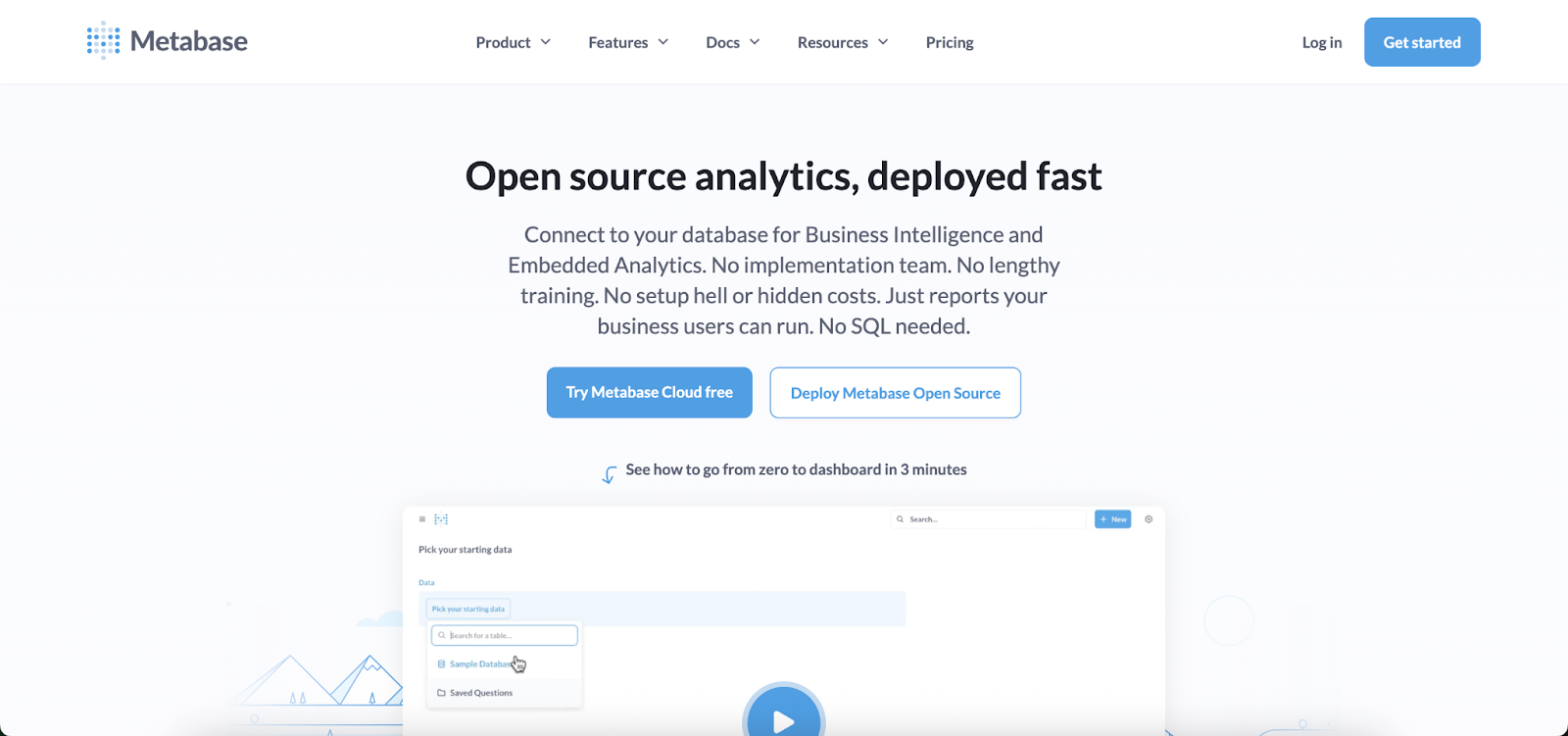
Metabase is a popular open-source BI tool. The open-source (free) edition supports embedding dashboards in your app, but it is not white-labeled at all – any embedded chart will carry a “Powered by Metabase” branding and the default Metabase styling. To white-label Metabase, you must upgrade to their paid plans.
White-label features: The Pro plan (and Enterprise) unlocks white-label embedding. This lets you remove the Metabase watermark and customize the embedded UI’s appearance to match your brand. In Pro, all Metabase logos/badges are removed by default.
You can also set custom colors and fonts for charts, and even host the Metabase app under a custom domain (so that embedded content and user login pages use your URL). Essentially, Pro makes it possible for end-users not to see Metabase’s name at all in the UI.
Embedding method
Until recently, Metabase embeds were done via iframes (either static or with JWT-based authenticated iframes for interactivity). This means the dashboard or chart lives in an isolated frame. New development: Metabase introduced an Embedded Analytics SDK for React that allows embedding charts directly as React components instead of iframes.
This SDK (available on Pro/Enterprise) gives much finer control – you can embed individual charts or even their full query builder as native elements, apply CSS variables to restyle components, and override certain interactions. This moves Metabase closer to the “standard” category for customization, but using the SDK requires a React front-end and coding.
Pros and cons
Pros: Metabase’s appeal is its ease of use and open-source roots. Pros include a low cost to get started (free for basic use), a user-friendly interface to build dashboards, and, with Pro, the ability to remove vendor branding and apply your branding relatively easily.
It’s a good entry-level solution for embedding if you need basic white label and rich BI features without building from scratch. The new React SDK also adds flexibility for those with React apps.
Cons: Key cons are that full white labeling is not available on the free tier at all – you must budget for at least $500/month Pro plan (plus $10 per viewer per month) to remove logos and get interactive embedding.
Moreover, Metabase’s embedding (especially via iframe) can still feel somewhat bolted-on; the UI retains Metabase’s layout conventions and if not heavily themed, might look out of place.
It also lacks advanced customization like injecting your own UI components (you are largely confined to Metabase’s dashboard layouts and chart types). In short, Metabase Pro gives you basic cosmetic control (logo, colors) but not a deeply customizable UI.
Additionally, if your app isn’t React-based, you’ll likely be using iframes for embedding interactive charts, which limits bi-directional integration.
Microsoft Power BI Embedded
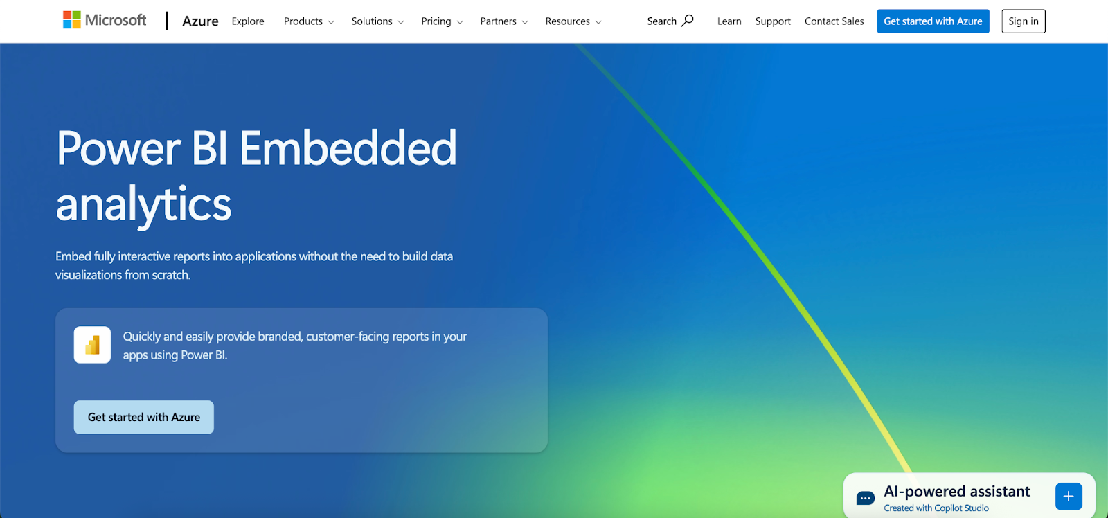
Power BI Embedded is Microsoft’s offering to embed Power BI reports and visuals in external applications. It’s powerful, especially if your data already lives in Power BI, but from a white-label perspective, it has significant limitations.
White-label features
Power BI allows some branding customization in embedded reports, such as applying custom report themes (colors/fonts) and hiding the Power BI logo or navigation bar on the embedded frames. However, the scope is very limited – essentially “skinning” the charts to your palette and adding your logo.
According to user feedback, you can change colors, fonts, and add a logo, but that’s about it. The core UI elements (like the Power BI loading spinner, or the feel of slicers/filters) remain identifiable. There is no native support for custom domains (embeds still come from the Power BI service), and users often can tell it’s Power BI if they are familiar with it.
In fact, Microsoft’s own documentation and community show that hiding all Power BI branding often requires workarounds (like overlaying HTML elements to cover logos), indicating it’s not straightforward.
Embedding method
Power BI Embedded uses iframes or a JavaScript API that essentially renders an iframe under the hood. You publish reports to the Power BI service and then embed them via an <iframe> or using Microsoft’s powerbi-client JavaScript SDK. Either way, the content is isolated.
This means limited control over the internals, though the JS API does allow some interactions (like applying filters or catching certain events). Still, it’s not a fully native DOM embed, so integration is not as seamless as a purely code-driven solution.
Pros and cons
Pros: Pros of Power BI Embedded include leveraging Power BI’s strong visualization capabilities and ecosystem. If your team already uses Power BI, embedding existing reports can be faster than recreating them in a new tool. It offers enterprise-grade security and scalability on Azure, and a broad range of data connectors.
From a branding standpoint, you can ensure that the reports adopt your company’s color scheme and don’t overtly show Power BI logos to end-users. It’s also pay-as-you-go pricing, which can be cost-efficient for smaller user counts.
Cons: For cons, the white-labeling is “basic” at best. As one review put it, the customization freedom is “very limited” – you can theme visuals, but the overall look and feel still screams Power BI to experienced users.
The reliance on iframes means you might face integration frustrations (e.g., resizing issues, no fine control of inner layout, difficulties passing complex interactions from your app to the report). Another con is the licensing complexity and cost: truly scaling Power BI embeds to many customers can become expensive (it’s billed by capacity and by user/view).
Also, Power BI’s UI (filters, menus) may not align with your app’s UX, and you can’t change that, potentially causing a less cohesive experience. In short, Power BI is a good BI tool, but it is not designed for full white-label SaaS embedding, so it may require compromises if used in that scenario.
Tableau Embedded Analytics
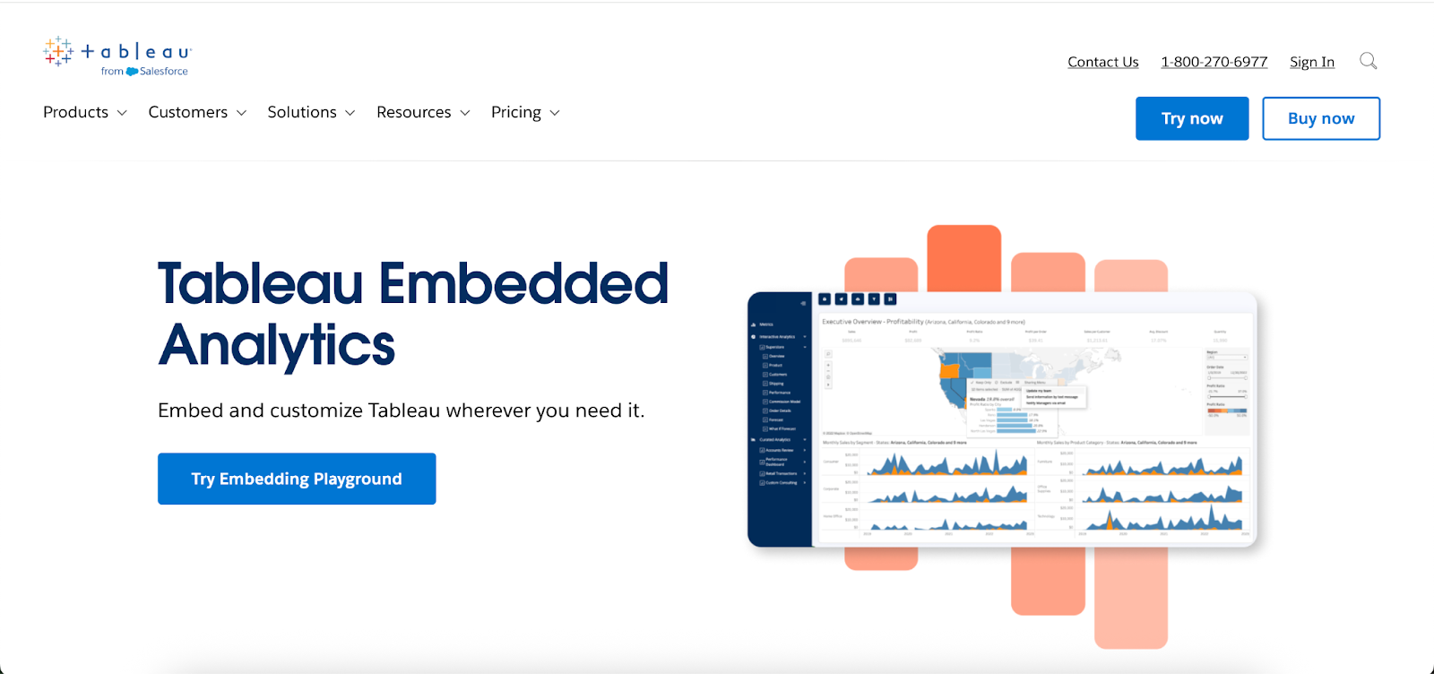
Tableau is a leading BI platform known for rich visuals. It offers an embedded analytics license for ISVs to integrate Tableau into their products. However, like Power BI, Tableau was originally built for internal BI, not for seamless OEM embedding, so white-labeling it comes with challenges.
White-label features
Tableau lets you do some brand customization when embedding: you can hide the Tableau logo, adjust the color scheme of the visualization to match yours, and use the JavaScript API to hide or show toolbar elements. But these are superficial changes.
Crucially, you cannot fully re-skin the Tableau interface that surrounds a dashboard. The embedded views still have Tableau’s distinct menus and controls (unless you hide them entirely, which removes functionality).
Customization options available for embedded dashboards are surprisingly limited – beyond basic colors and logo hiding, achieving a truly seamless integration requires hacks.
Any deeper UI changes (like changing filter widget styles or adding custom buttons) are not supported. There’s also no first-class custom domain support for Tableau Cloud embedded content; users will briefly see Tableau’s domain during auth unless you host Tableau Server yourself.
Embedding method
Embedding Tableau typically means using an iframe pointing to a Tableau Server or Tableau Cloud view.
You generate a secure embed link (with or without a toolbar) and drop it in your app. The content is in an iframe, though Tableau does have a JavaScript API that can communicate with the iframe for operations like filtering, refreshing, or getting selections.
Still, it’s not integrated into your DOM. The iframe nature also means if your users inspect closely, they might notice references to Tableau in HTML or network calls. Essentially, it’s an iframe with slight theming.
Pros and cons
Pros: Pros for Tableau include its powerful visualization capabilities – few tools can match the interactive drill-downs and complex chart types Tableau offers.
It has strong community support and your team may already be skilled in using it. For white-labeling, a positive point is that you can hide most obvious Tableau branding, so casual users see your branding first.
Tableau’s reliability and scalability for analytics workloads are proven, and it provides features like row-level security which are important for multi-tenant scenarios (though configuring that in an embed context is non-trivial). If your use case needs top-notch analytics and you’re willing to settle for a “good enough” UI integration, Tableau could serve.
Cons: The cons revolve around integration and cost. White-labeling is an afterthought in Tableau – it wasn’t built with OEM embedding as a primary use case. Thus, the embedded experience often feels bolted on; as one product manager put it, “Works well for internal BI usage, not for embedded analytics”.
Specific drawbacks: multi-tenancy requires complex workarounds (each customer might need separate projects or filter rules); version upgrades can break your custom embed tweaks; and performance can suffer with iframes and large data (no built-in caching layer for embeds).
Furthermore, pricing can be an obstacle, as Tableau’s embedded licensing tends to be expensive, often charged per end user (which can “punish” a successful SaaS product with high fees as it scales). In summary, Tableau embedded is powerful but heavy, and its limited white-labeling means the experience might not fully meet modern SaaS user expectations for a native feel.
Other basic white-label options
A few other BI tools fall in this basic category. For example, Amazon QuickSight (for AWS) offers embedded dashboards but only allows minimal theming – it’s largely an iframe with an AWS logo that can’t be completely removed, so it’s similar to the Tableau scenario.
Looker Studio (Google), formerly Data Studio, can be embedded as well, but it has almost no white-label capabilities (Google’s branding is subtle but present, and styling options are limited).
In general, traditional BI platforms (SAS VA, IBM Cognos, etc.) when embedded, will typically show similar limitations: you might get the content in your app, but making it truly “yours” is hard. If your priority is just to get charts in place quickly and branding is secondary, these can work; otherwise, you’ll likely consider more customizable solutions.
Which white-label embedded analytics tool should you choose?
With a range of tools and approaches available, the right choice depends on your specific needs, resources, and goals. Here are some recommendations based on typical scenarios:
Use a basic white-label tool (e.g., Metabase Pro or Power BI Embedded) if your priority is to get embedded charts quickly with minimal development, you’re okay with an iframe-based embed and you just want to remove obvious third-party logos.
Use a standard white-label platform (e.g., GoodData, Yellowfin, Qrvey, or Luzmo) if you want a more out-of-the-box solution that allows more branding customization. These are great when you need relatively fast time-to-market but also must feel more like your company’s branding guidelines.
Use Embeddable or Sisense’s Compose SDK if you want a truly native-feeling, deeply integrated analytics experience that communicates with your application as if it were an in-house feature.
These advanced solutions are ideal when the analytics component is central to your product and user experience – you want it perfect. Choose Embeddable if you value maximum front-end flexibility and want a purpose-built tool that’s designed specifically for the job..
Book an Embeddable demo to learn more
Frequently asked questions
What is white-label embedded analytics?
White-label embedded analytics lets you integrate a third-party analytics platform into your product while customizing its look to match your brand. This includes changing logos, colors, and sometimes even the layout so users think it’s part of your app. The goal is to deliver analytics faster without revealing the external vendor.
What are the main levels of white-labeling available?
Basic white-labeling removes vendor logos and applies simple theme changes. Standard offers deeper styling options and sometimes custom domains. Advanced allows full UI control and integration directly into your application’s code without iframes.
Which tools are best for advanced white-label needs?
Embeddable and Sisense Compose SDK are top choices for advanced scenarios. Both let you build analytics directly into your app’s DOM with full styling control. These options are ideal when you want analytics to look and behave as if your team built them entirely in-house.
Why does iframe-free embedding matter?
Iframe-free embedding integrates analytics directly into your app’s DOM, making them easier to style and interact with. This allows your global CSS and responsive layouts to apply naturally. It also improves performance and avoids cross-domain or cookie issues.
How should I choose the right white-label analytics tool?
Consider how much customization you need and how much development effort your team can invest. If you need something quick and lightly branded, a basic option works. If branding and UX consistency are critical, look for standard or advanced solutions.
References
- Wikipedia — White-label product: https://en.wikipedia.org/wiki/White-label_product
- Investopedia — What Is a White Label Product, and How Does It Work?: https://www.investopedia.com/terms/w/white-label-product.asp
- TechTarget (SearchCloudComputing) — What is SaaS (software as a service)? (section: Development of white-label SaaS): https://www.techtarget.com/searchcloudcomputing/definition/Software-as-a-Service
- TechTarget (SearchITChannel) — White-labeling cloud services: Pros and cons: https://www.techtarget.com/searchitchannel/feature/White-labeling-cloud-services-pros-and-cons
- Wikipedia — Private label (distinctions vs. white label): https://en.wikipedia.org/wiki/Private_label
- G2 Glossary — White Labeling — Definition: https://www.g2.com/glossary/white-labeling-definition